
New logo and visual identity for MAGIC NOOK
A lot has happened since my last entry, both in the world and in my life. My plans for Second Life has been delayed but not cancelled. I'm taking my time and slowly get things done.
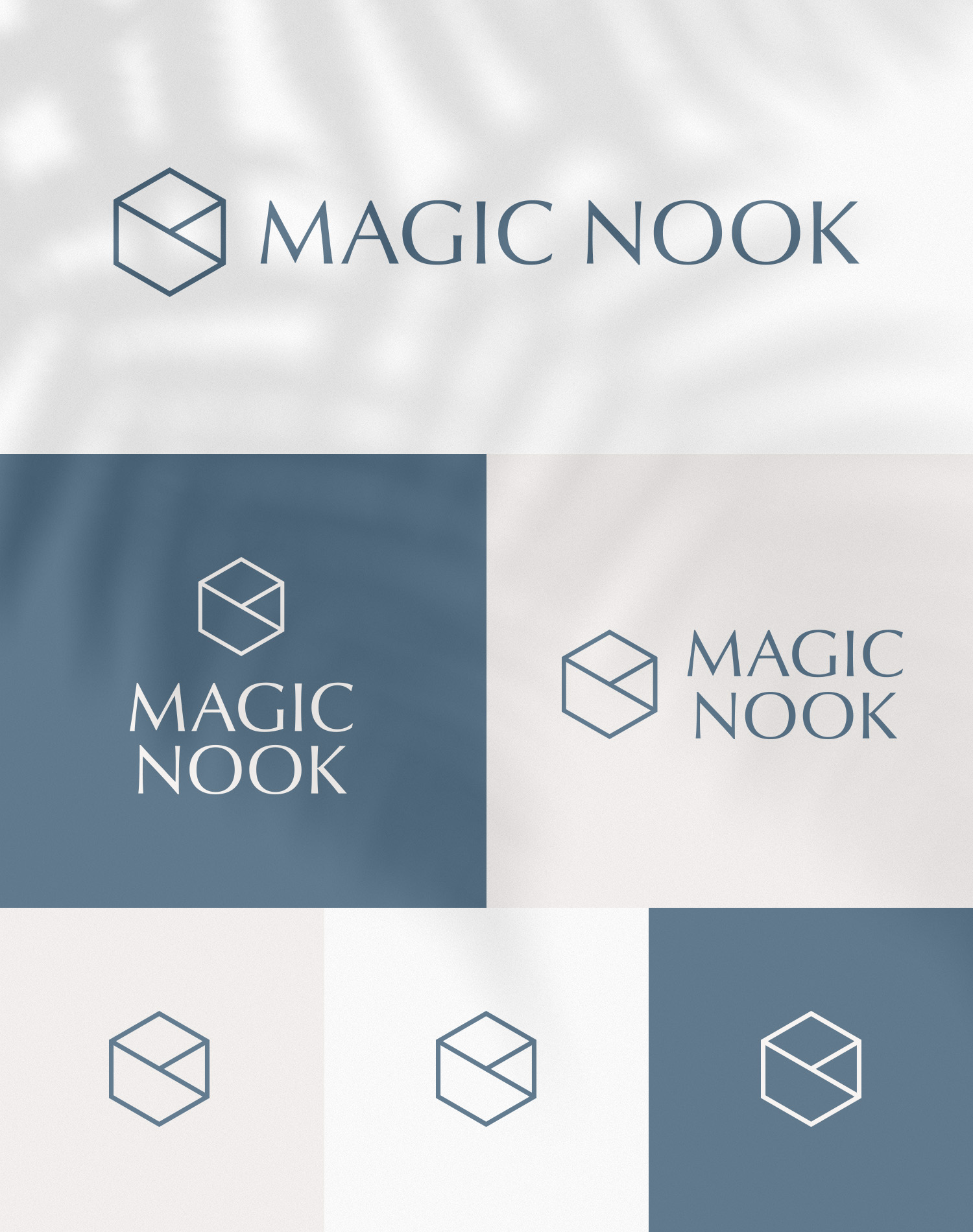
I've been working very hard on a new logo and visual identity for MAGIC NOOK. I'll miss the old logo a little bit but I think it deserves a happy retirement. As my vision for the brand evolved, I wanted more modern, mature and balanced look for the logo, that would also effectively communicate my brand values. I explored a lot of shapes, colours and fonts before settling on the final design and today I want to share it with you.


Let me know what you think!

2 comments
I'm glad your back, and the new logo is awesome. Even though everything is mesh mostly, I still use your prim twisting guide often!
ReplyDeleteThank you so much! :) It's taking me a while to get back into the swing of things, but I'm slowly finishing the new store building at the moment, yay!
Delete